Web Crawler in Action: How to use Webspot to implement automatic recognition and data extraction of list web pages

Introduction
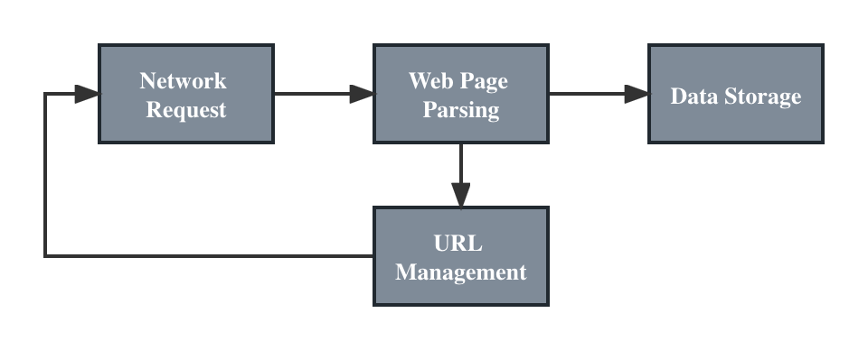
Using web crawling programs to extract list web pages is a one of those common web data extraction tasks. For engineers to write web crawlers, how to efficiently code and generate extraction rules is quite necessary, otherwise most of the time can be wasted on writing CSS selectors and XPath data extraction rules of web crawling programs. In light of this issue, this article will introduce an example of using open source tool Webspot to automatically recognize and extract data of list web pages.
Webspot
Webspot is an open source project aimed at automating web page data extraction. Currently, it supports recognition and crawling rules extraction of list pages and pagination. In addition, it provides a web UI interface for users to visually view the identified results, and allows developers to use APIs to obtain recognition results.
Installation of Webspot is quite easy, you can refer to the official documentation for the installation tutorial with Docker and Docker Compose. Execute the commands below to install and start Webspot.
# clone git repo
git clone https://github.com/crawlab-team/webspot

# start docker containers
docker-compose up -d